

 Have you ever created a dashboard that had so many data visualizations that users were forced to scroll (and scroll) down the screen to find the information they’re looking for? We’ve all been there. Sometimes you need to fit a LOT of information in a single dashboard. But adding a LOT of information is overwhelming to users. Enter the principle of progressive disclosure.
What is Progressive Disclosure?
At its essence, the design principle of progressive disclosure ensures that users are viewing only the information they need to see. One of my favorite real-world examples of progressive disclosure involves kitchen cabinets. How would you feel if you walked into your kitchen and all the cabinet doors were open? It’s overwhelming right? If you need to get a cup out of the cabinet, do you open all the doors, or only the one where the cups are stored?
Now imagine you visit a dashboard to answer a specific question, but you’re presented with an overwhelming number of data visualizations. How long would it take for your eyes to scan the screen to find what you are looking for? Wouldn’t it be better to open the dashboard and be presented with the “right” information you need? In a nutshell, that’s the principle of progressive disclosure.
Pardot Engagement Dashboard
The B2B Marketing Analytics App in Einstein Analytics comes with several useful dashboards to allow users to analyze the effectiveness of their Pardot marketing assets. These dashboards are a great first step in analyzing your marketing assets and we highly recommend users begin their analytics journey with these dashboards and then customize and create new visualizations based on unique business processes and needs.
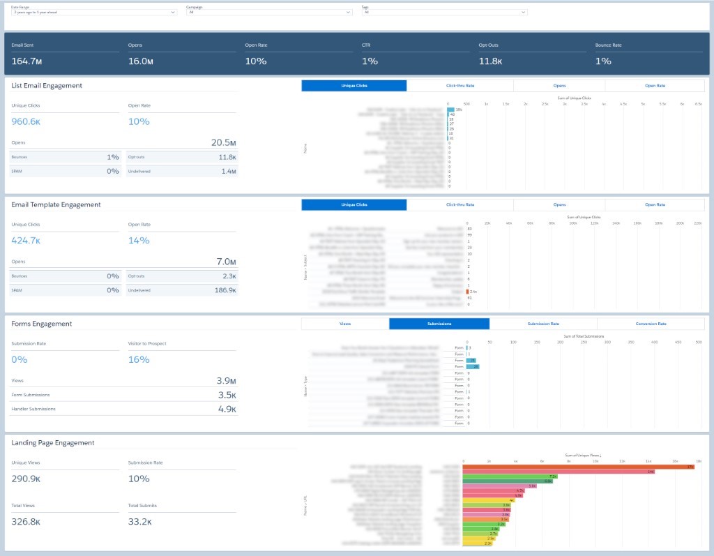
The Engagement Dashboard helps to answer questions related to list emails, email templates, forms, and landing pages. Users can use the dashboard to answer questions like:
- What emails generate the most clicks and opens?
- Are there campaigns that are performing better or worse than others?
- How are our teams performing in various regions (using Tag filters)?
The Engagement Dashboard displays key metrics at the top followed by details about individual Pardot assets including List Email Engagement, Email Template Engagement, Forms Engagement, and Landing Page Engagement. One of the challenges we’ve seen is that sometime users are interested in drilling down into details on assets located further down the screen, like Forms and Landing Pages. In order to analyze the data they select their filters, scroll down to view results, scroll up to adjust filters, scroll down to view results (repeat as needed). This scrolling can be time consuming.
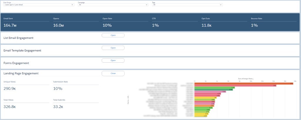
Instead, why not apply progressive disclosure, to allow users to only view the information they need to see? In the screenshot below, you can see the same out-of-the-box dashboard, but with a few enhancements. The new ‘Open’ and ‘Close’ buttons allow users to only view the sections of the dashboards they wish to see – collapsing unnecessary sections like an accordion. Below, users can choose to open only the Landing Page Engagement section leaving the rest of the sections collapsed so that the most important information they need is easily accessible.
Progressive Disclosure: Step-by-Step
Maybe one day in the future, Einstein Analytics will incorporate new functionality to create more user-friendly navigation on dashboards. But for now, we can use a combination of Links and Pages to create the same effect.
To start, you will need to create multiple Pages for each section you wish to open/close. For this example, we have created the following: Open All, List Email, Email Template, Form, Landing Page, Close All

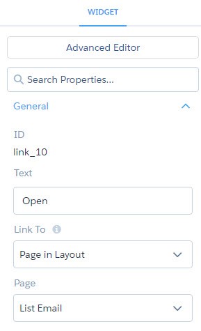
Next, drag the Link widget onto the appropriate section on the dashboard and create ‘Open’ and ‘Close’ buttons. Below are the widget properties for a link that controls the view for List Emails. When a user clicks on the ‘Open’ link, they will be taken to the List Email page which is configured to only show List Emails. You can control how the button looks using the Widget Style section for the Widget properties. For example, adding a border and increasing the value of the Border Radius to 16 will make the link look more like a button.
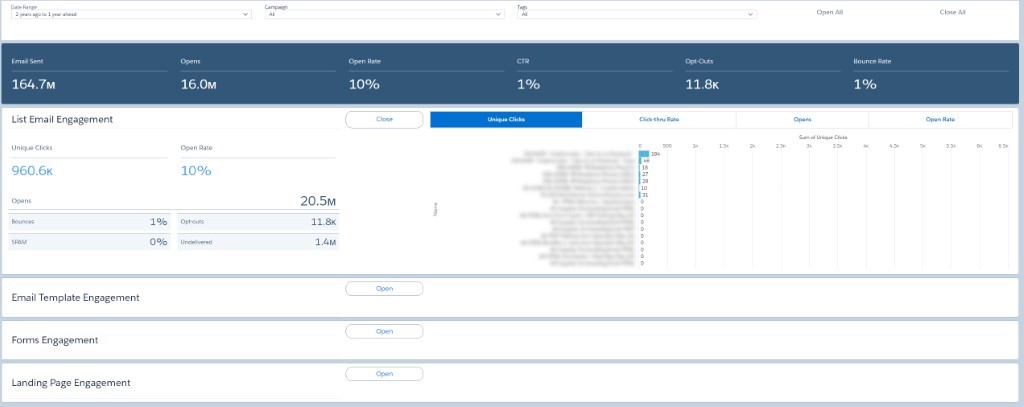
For the ‘Close’ buttons, the widget properties will link to the Close All page. You can make more pages if needed, depending on the type of views that work best for your organization. These pages are just recommended starting points.
There you have it….progressive disclosure for the Pardot Engagement Dashboard. Obviously, there are additional types of customizations you can do. This is just a very simple example of how you can take an out-of-the-box dashboard and improve the UI/UX so that it meets the needs of your individual users.